2ND SEM - MIDTERMS: Business Card
_____________________________________________________________
Wait, you have a business? And you want a business card? Bro, I've got you covered. Let me give you some of my tips in making a business card.
First of all, pick an orientation. Is it Landscape or Portrait? A common orientation for business cards are in landscape forms, but it doesn't mean that portrait business cards do not exist. Just choose which orientation you want to use and then form your contents from there.
Because I like designing and doing at least two designs, I've decided to do one portrait and one landscape to try and make a business card out of. The next tip is to figure out what you want to put in your card.
Figure out the purpose of a business card for you. It should remind the receiver who you are for the company and where to contact you. What's more is the business card defines and also affects the first impression for your company or the business you work for.
Put only important and necessary information that will direct the receiver where to find or contact you. Information for business cards should contain your company name, company logo, your name and position, and contact information. Make sure that the contact information should state a business contact number, business e-mail, the website, and the site of your company.
The third step is to figure out what design you will be using. Will it be related to the work of the company, or what's it all about? The colors should resonate with the vibe you want to show the receivers.
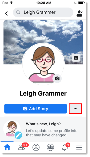
Personally, what I did with my business cards is base it off of Facebook, the popular social media, specifically the application's UI design for a user's profile. I chose this design as a basis because it's part of media and exercises new platforms for opportunities, just like what I'd envision my company to be like.
I chose the color of reds and pinks, symbolizing, warmth, kindness, and courage. That is how I want to show my audience what the company is about. Colors are also important when it comes to designing a card since this will affect the company's image, as mentioned before.
The logo I chose is a hexagonal continuous loop, which symbolizes continuity, opportunity, and longevity. The design for the landscape version is modeled as a director's cut, which is also a symbol for media.
Here's how it looks like (the landscape version):
front:


Comments
Post a Comment