2ND SEM - MIDTERMS: Magazine
OMG! A MAGAZINE?! AND IT'S FOR ARTISTS?! - Multimedia Arts Magazine
_____________________________________________________________
Aside from being a tip for making magazines, I just really want to imagine being interviewed for a magazine. And yes, the main target would be artists.
Alright, to start out, as usual, I searched for a good reference. I don't need a lot, just one reference is enough for me. I found this reference from escapemotions.com, and I really love the lay out and the way it was formed. The color palette is striking as well and very unique, which made me want to do a similar approach.
I wanted to incorporate the MMA course as well as market myself to the public. I also wanted to feature myself as a public figure and an inspiration to the artists all over the world. I made sure to look for a similar reference to what I was trying to go for.
Here is the reference I chose:

reference link: https://www.escapemotions.com/blog/top-10-inspirational-magazines-for-artists
Then I selected a color palette. I chose orange, white, and black and to match the main artwork I am showcasing, which has a red background. I chose warm colors for an inviting ambiance and made black and white for the text and background for a clean slate.
I chose a picture of myself that corresponds to the color palette to make it fit. I then created a made-up magazine brand or studio then added some kickers, a headline, and some previews of the contents of the magazine. I also included a small introduction on the bottom of the front page. For fun, I also included a barcode.
Here's how it looks like as individual pages:


Here's how it looks like as shown in the reference:

I had so much fun that I decided to do another version. This time with a two main colors, being candlelight orange and amethyst purple.
Here is the reference of the main colors I used:
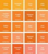

reference links: https://www.flickr.com/photos/21566302@N06/7035518797/ | https://ingridsnotes.files.wordpress.com/2014/02/purple_revised.jpg
Using a different font from the first, I decided to experiment with the front page and attempt something similar to my reference. The picture I used is different now, and looks like it was shot in a studio. I included more contents in the page and used the main colors of the company I made up. I used my past works that I made for my projects, and made the contents as if they were taken from my interview as a MMA figure.
Here are the individual pages for the second magazine:


Here is how it looks like as a whole:

It's always a good idea to play around with the layout and the colors. It is also alright to change the pages if needed. I love to make sure everything looks good, there are no typography errors, and the grammar is right. This is a magazine so the contents are important.
It is also a must that the visual impact is good and appealing. I love the headings of the second magazine in the second page. It gives emphasis on which words are the main point in the content. I added variety in it but also put unity in mind as I made the pages. Keep these principles as a guideline to make sure that the output will not be overcrowded and looks interesting. Always experiment as well to find the best layout.


Comments
Post a Comment