Good day, guys! Recently, we've been given a cool assignment where in we are expected to draw something that represents or shows the seven(7) elements, seven principles, and principles of design and ink value techniques!
First of all, what are the 7 elements? Those are known as:
1. Lines
2. Shape
3. Color
4. Value
5. Form
6. Texture
7. Space
For the 7 principles, they are:
1. Balance
2. Contrast
3. Emphasis
4. Movement
5. Pattern
6. Rhythm
7. Unity
I tried to include as many elements and principles as I can in my artworks, so without further ado, here are my artworks that represent both the seven elements and the seven principles:
"My soul is as colorful as me"
In my first artwork that I've entitled "My soul is as colorful as me", You can see the presence of the element of Lines, Shape, Color, Value, and Texture. There are a variety of lines that portray my piece, most obviously, her face. With a good combination of Shape, Color, Value, and Texture, you can see the vibrancy I've presented and it all ties the piece together.
In principles, I have made sure to put Balance, Contrast, Emphasis, Pattern, Rhythm, and Unity. There is Balance wherein the lines are many, in plenty of lengths, and a variety of directions but it balances out in a whole picture and it is in Unity, wherein there is harmony. Contrast is obvious in this piece, a dark background connected to her hair makes her face pop, and also emphasizes her face, which shows the next principle, Emphasis. Pattern and Rhythm is also present in her face as there are a combination of lines, shapes, and color, it is not messy even though there is repetition and vibrancy.
What makes this piece unique is the way I managed to draw the contrasting colors, the majestic royal blue, paired with a lot more colors that paint her fair white face. The asymmetry it presents also plays a part since the main object of my work is the face of the woman and its patterns. The main elements and principles I want to point out would be Lines, Shape, Color, and Contrast, Pattern, and Unity, respectively.
"The tears that pour"
In this piece, I have made it more simple but the process took longer than the first. The elements shown in the picture would be Color, Value, Form, Texture, and Space. The colors are visible for the viewers to determine which is which and what is what. The main colors here are red and blue, which are on her eyes and on her lips. Her cheeks are also a bit red but that also has texture, like her main features. As you can see, her hair is in an Ombre pattern, which is a principle, but it also has value. This piece has space, it is simply a girl without a background, creating an illusion that she is in an open and empty area.
In the principles, it has Balance, Contrast, Emphasis, Movement, Pattern, and Unity. The simplicity of the piece creates Balance, yet also emphasizes her main features, like I said which are her eyes and her lips. Its also another form of contrast that has space in between. Movement is present where her tears that are connected to her eyes are flowing, also showing near contrast on her cheeks. The pattern would be her Ombre hair and all in all, ties the piece in Unity.
What makes this drawing attracting to viewers is how the colors blend in together, the simplicity of its Unity and the Value and Balance that shown together. It has an aesthetic appeal and a good match of colors.
Here are other examples of my work that involves the same seven elements and seven principles in digital form. (I used references here btw~)
Principles of design and ink value techniques
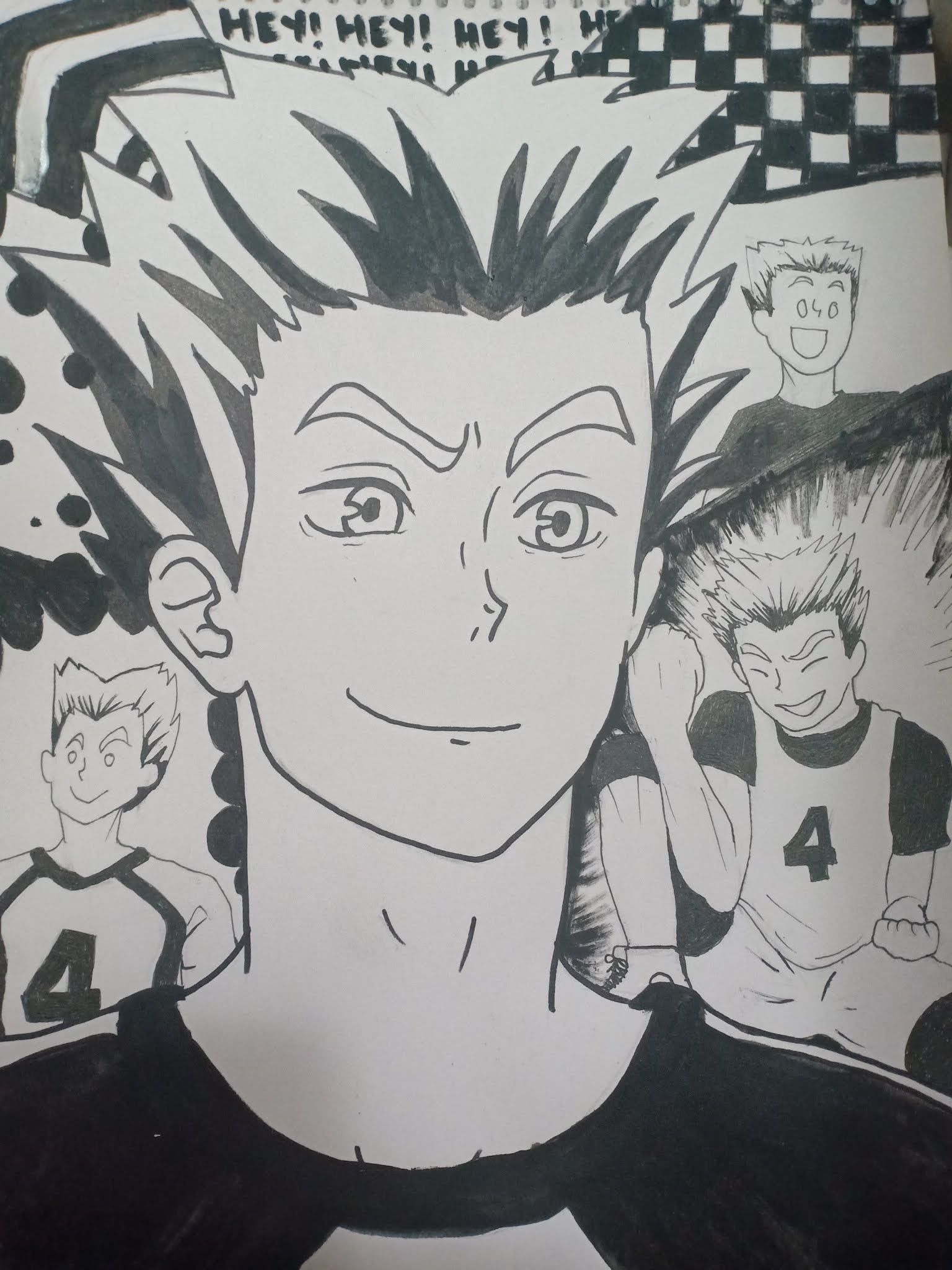
"Bokuto shrine"
This one is my work for Figure in space, which also has 4 characters all in all. It is mainly black and white, and I used a variety of pens and markers to achieve it. My concept here is to show the different looks and moods of this fictional Japanese anime character, named Bokuto Kotaro. I chose this concept as I have an emotional attachment to him and he, overall, gives me a sentimental feeling. I used a lot of different shapes and lines to fill in the background but made sure that the main subject is still visible and the main part of the drawing, while at the same time showing his goofiness, happy, confident, and excited side.
That's all for this week's entry! Please leave a comment and perhaps show me YOUR own work too! This has been Nina, sharing good vibes and positivity. Thank you for reading this blog and have a great day!


Comments
Post a Comment